
Guide
Wedding colours: choosing a palette, from invitations to the photo booth
By La Cabine Bretonne · published · updated
Choosing your wedding colours is one decision that makes a hundred others easier: the flowers, the invitations, what the wedding party wears, the tables and even the photo booth frame. The challenge is finding a palette that feels like you and works from the stationery to the decor. Here’s a four-step method, followed by seven palettes to adapt, each with matching photo booth frames.
How to choose your wedding colours
A wedding palette comes down to three colours: a main colour that sets the tone, a secondary colour to go with it, and an accent colour used in small touches. Go beyond that and things quickly get muddled.
- Start with the venue: a barn calls for warm, natural tones, a modern function room can take bolder colours, and a beach pairs with blues and sandy shades.
- Think about the season: pastels and soft greens feel fresh in spring, while ochres and burgundies warm up the autumn.
- Consider the light: an evening that carries on by candlelight brings out gold and deep tones, while a daytime celebration flatters lighter colours.
- Try the palette on something real: a ribbon, a fabric swatch, a flower. What looks lovely on screen doesn’t always look the same in person.
Sage green: soft and botanical
Sage green, both grey and gentle, goes with almost anything: off-white, beige, dusty pink, light wood. It suits spring and summer weddings, in a garden or indoors, and sits naturally alongside eucalyptus and foliage.
For the photo booth, Sage Green keeps things simple with two intertwined initials, while Sage & Blush pairs a blush-pink background with sage-green lettering across fifteen layouts. The sage green collection gathers every frame in these tones.

Terracotta: the warmth of a summer or autumn wedding
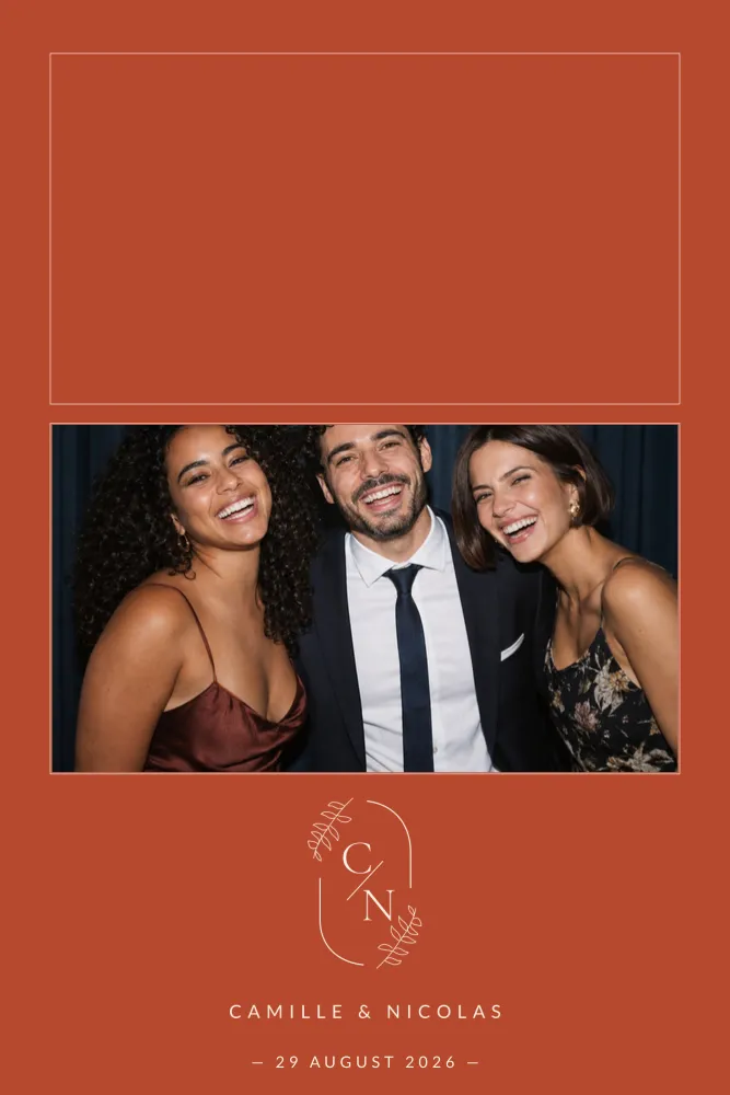
Brick, rust, ochre: terracotta brings instant warmth. Paired with cream and olive green, it evokes weddings in Provence, Tuscany or a barn at sunset. It works as well at the end of summer as it does in autumn.
Terracotta Monogram sets your initials in a medallion on a brick background, and Terracotta Arch frames the photos with a cream arch and line-drawn flowers. Every design in this shade is gathered in the terracotta wedding collection, and the autumn wedding collection extends the palette.
Blue: from deep teal to sky blue
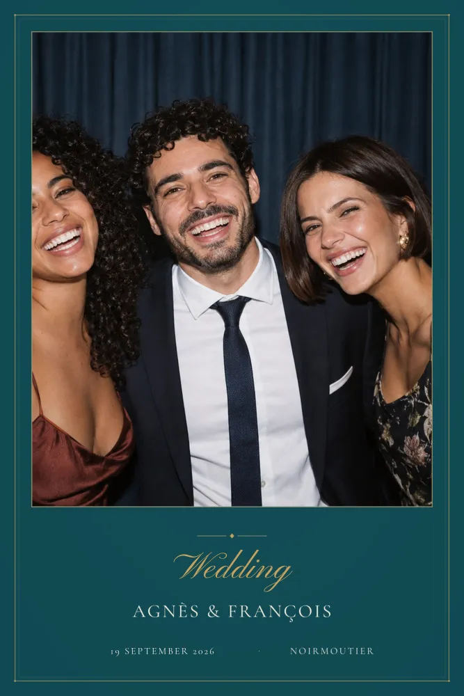
Blue comes in endless variations. Deep and paired with gold, it makes for an elegant, almost classic wedding; lighter and paired with white, it brings the seaside and holidays to mind. It flatters many complexions and works in every season.
Deep Teal & Gold has the polish of a traditional invitation, with a double gold line. Blue Anemones relies on blue-grey watercolour flowers for a quiet, graceful look. The blue wedding collection brings together every frame in this family, from midnight blue to sky-blue gingham.
Lavender, dusty pink, burgundy: three palettes with character
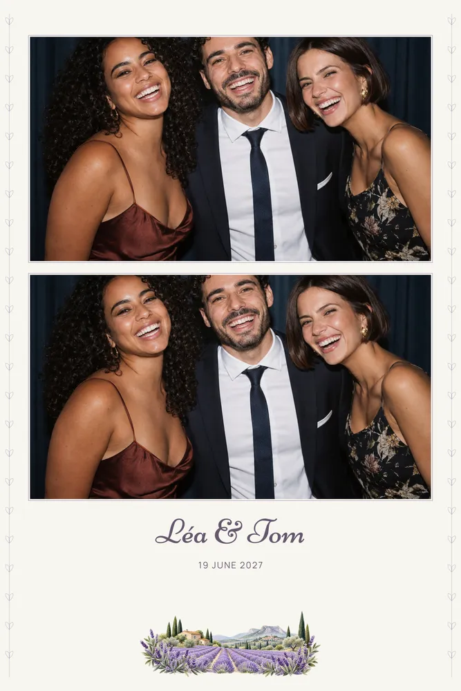
- Lavender, a muted purple with linen tones, brings a breath of Provence to a summer wedding. Lavender Field and Lavender Sprigs pick up those shades and echo the bunches placed on the tables. The lavender and lilac collection gathers the other mauve designs.
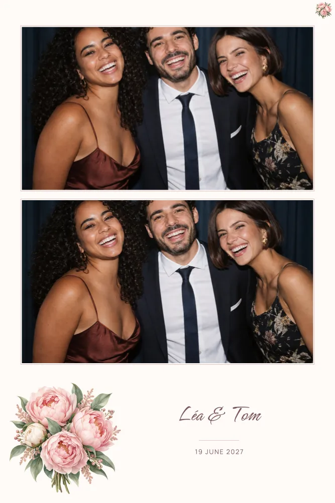
- Dusty pink, a romantic wedding classic, pairs with white, gold and green. Blush Peonies offers a gentle take; the dusty pink collection has more.
- Burgundy, deep and refined, warms up an autumn or winter wedding, especially with gold accents. Burgundy Marble pairs it with gold-veined marble and calligraphic names; more cold-season shades in the winter wedding collection.
Black and gold: the elegance of a dressy evening
Black and gold suit evening weddings, black-tie receptions and Art Deco themes. Gold catches the candlelight, and black makes faces stand out. To keep it from feeling too stark, add an accent colour: emerald green, ivory white or midnight blue.
Golden Night sets fine gold frames on a glittering black background, Golden Sparkles scatters golden stars across fifteen layouts, and Emerald pairs a jewel green with delicate gold. The black and gold collection has more designs in this style.
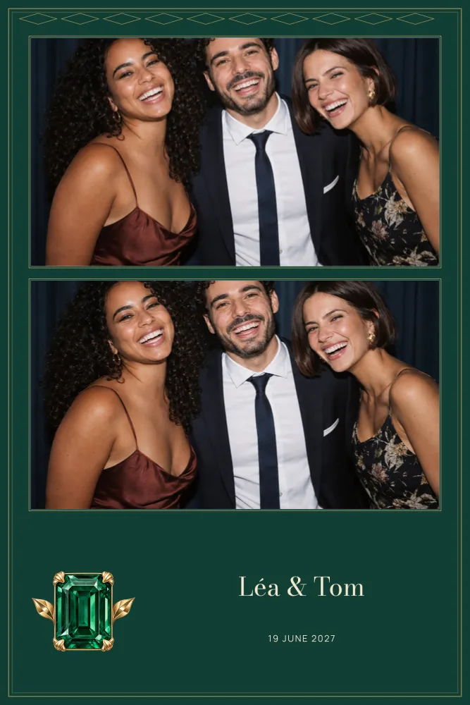
Carrying your palette from stationery to photo booth
Once you’ve chosen your palette, use it everywhere, but not in the same way everywhere. The main colour dominates large surfaces: tablecloths, the invitation background, flowers. The accent colour is kept for details: a ribbon, a wax seal, the names on a frame.
- Invitations and stationery: the main colour as a background or pattern, the accent for your names.
- Flowers and table decor: the full palette, with plenty of greenery to tie the colours together.
- What the wedding party wears: the secondary colour, which is easier to wear.
- The photo booth frame: one of the few things every guest takes home. Use your main colour and the lettering style of your invitations, so all the keepsakes from the day feel connected.
For the next steps, our guides to planning your wedding photo booth and wedding frame wording are here to help.
Matching a frame to your exact colours
Found a design you love, but not quite in your shades? On our designs, colours can be changed one at a time. Open the editor, for example customise Terracotta Monogram, then change the background colour, each colour in the artwork or the colour of a single line of text. The preview updates with every change, and your draft is saved automatically on your device, with no account to create.
Then add your names and date, download the PNG overlay at full print resolution, transparent where the photos go, and send it to your supplier, along with the dslrBooth package if their booth uses it. To explore other shades, browse all our designs or the wedding designs.